Well, this is the second issue, and it's dedicated to things you've most likely never seen and know nothing about. I'd even go so far as to say you probably couldn't even imagine that such things exist or that someone actually made them. Just think about it.
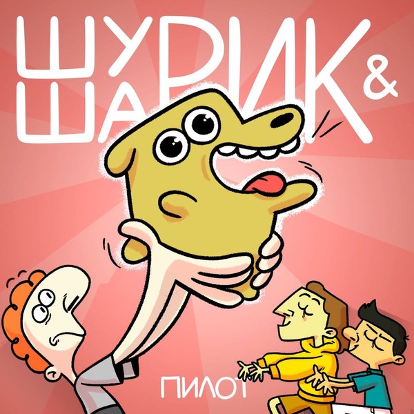
1) Shurik & Sharik
🖼️ funny_dog.jpg
“There are no ups without downs. It's a pity sharks can't fly((( It would be cool: a flying shark…” - Zhora
Are you interested in Russian web animation? No? Yes? Either way, let me present Shurik and his dog Sharik. Plus, there's Zhora - a business shark, and Platon - well, Platon.
The main highlight of the project is that it's one huge, juicy shitpost telling surprisingly cozy and atmospheric little stories. "Shurik & Sharik" isn't the kind of work that forces you to overanalyze and dig deep to uncover the hidden meaning while explaining everything through memes and absurdity - and in its own way, that's pure genius.
Shurik & Sharik is very similar to Smiling Friends, but with discussions and conflicts relevant to people from the post-Soviet space, where stories are built around Friendship, Love, and Family. While in Smiling Friends we see a workplace setting with friends as coworkers, in Shurik & Sharik the main characters are friends and neighbors. By the way, the creators themselves mentioned drawing inspiration from Smiling Friends.
A completely forgotten 6-episode OVA from the early 1990s. Overall, it's a simple romantic story about 22-year-old police officer Yumi Takeshita and pickpocket magician Toru Ichidaiji. She also has a wild partner - 19-year-old Shiho Ninomiya, who hasn't been fired from the police force only because her grandfather happens to be the police chief of the Tawagoto precinct, where the events take place.
It's definitely worth watching for the 90s aesthetic, Ninomi's antics, and if you enjoy romance.
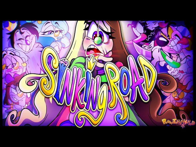
3) Sinking Road
🖼️ sddefault.jpg
While we're waiting for Vivziepop to give us any deeper exploration of her ideas - and right now, after season 2 ended, we still don't have a fully accurate understanding of many rules in her universe - Moa Olsson spent 6 years creating a complete 52-minute and 20-second story that needs no additions whatsoever.
The story itself tells about Dotty Duette, who was pushed into the sea and carried away to an underwater village, as I understood it, called "Sinking Road". There, she encounters the 8 Buddhist precepts. Throughout the plot, she tries to escape. I don't know how useful this detail is, but one side of her face is paralyzed.
The project stands out for its unique style, which to me looks like a mix of classical 20th-century animation, flash animation, and hyperpop. I think I don't have much else to add.
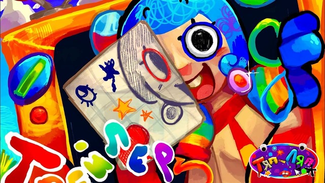
“Do you remember your first drawing, craft, application, or just a homemade thing? Most likely, as a child, you proudly showed them to adults, who put your next creation on a shelf and praised you. But after all, a piece of soul, a fragment of your creative star was invested in each craft. And that means that just like you, your creation is alive. Just imagine a place where a dozen such worlds are collected with their own nature, residents, and so on. All this is our native children's stand!”
Basically, that's everything I managed to get out of TYAP-LYAP. I also gathered that the main characters - residents of one of the crafts - got bored and decided to go on a trip across other crafts. The catch is that leaving their craft without the princess's permission is strictly forbidden. Naturally, they didn't ask for permission and set off on their journey anyway. Understanding the plot in more detail is pretty tough, since the voice acting for some characters was recorded on a brick phone straight out of the 2000s, which your dorm roommate washed in the laundry together with his jeans.
That said, TYAP-LYAP shows off a pretty interesting style, and pretty much everything revolves around the "half-assed" approach. It's worth a watch simply because it exists and it completely melts your brain.
That was the second issue of "What to Watch?" If I didn't manage to surprise you, then I guess I did a poor job collecting material... Because the whole point of this issue was to surprise you, since we're no longer talking about something like ENA or regular anime, but about the niche of the niche.
Then again, Shurik & Sharik isn't really a niche - it's mainstream Russian web animation, though for a Western audience it's definitely a niche. And Sinking Road is mostly a niche for the post-Soviet viewer. But overall, this collection ended up being made of little-known projects, so I had to dig way deeper than usual for information on each one.
Hello everyone! Today, I’m going to share my personal top 5 best house spiders.
Important information for residents of Australia and New Zealand: we will mostly be talking about spiders common in Europe and North America. Oh, and yes, all 5 spiders are venomous, but they won't just bite a human for no reason - only if provoked - and their venom is not fatal. In any case, you shouldn't touch or catch a spider with your bare hands. If one is bothering you, use the time-tested cup and cardboard method.
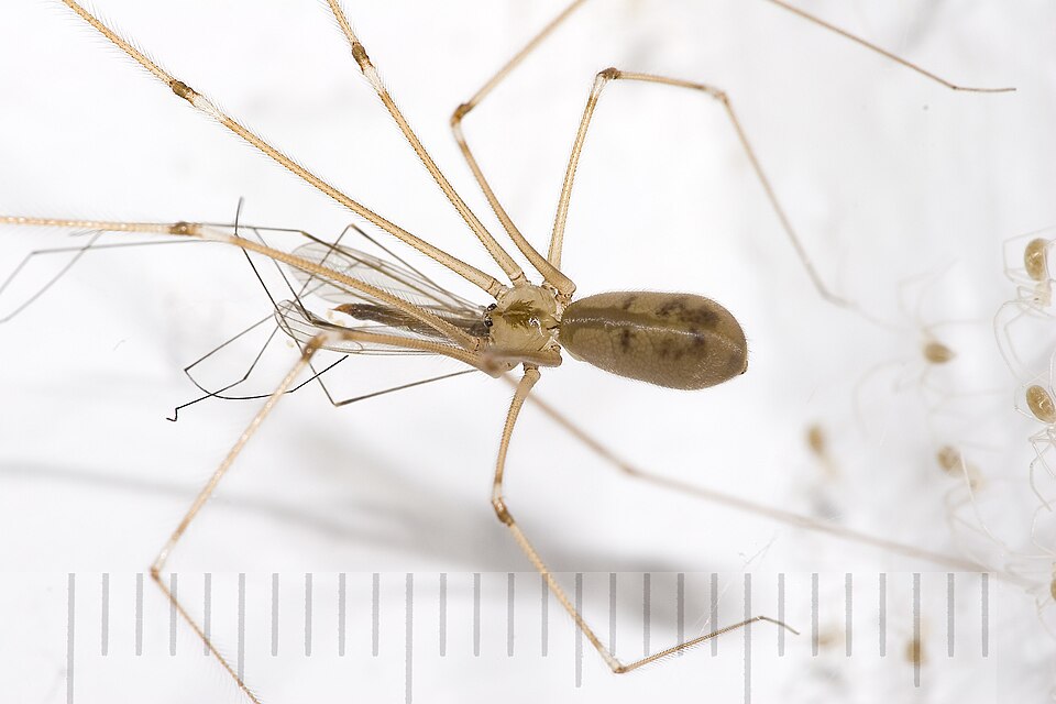
1. Cellar Spider Pholcus phalangioides
🖼️ by_OleiPholcus_phalangioides_6908.jpg
Heading our top list is the cellar spider - the ultimate perfect roommate. This guy put all his evolutionary points into incredibly long, thin legs, a small body, and loose, messy cobwebs in the corners of ceilings, basements, and bathrooms. It preys on tiny insects and even other spiders.
Parameters: Body length - approximately 7-10 mm Leg length - up to 5-6 cm Lifespan - up to 3 years Hunting method - cobweb snare
2. Giant House Spider Eratigena atrica and related species
🖼️ by_Ryan_Hodnett_giant_spider.jpg
A large brown spider with long legs that hangs out in basements, garages, and occasionally living areas. It weaves funnel-shaped webs and catches small arthropods. Despite its intimidating size, it is very shy around humans. You are especially likely to notice these spiders in late summer and autumn, when males actively start searching for mates.
Parameters: Body length - approximately 10-16 mm Leg span - in males can reach a few centimeters, sometimes around 7-8 cm Lifespan - males usually live about 1.5 years, while females can live 2 years or longer Hunting method - web with a funnel-shaped retreat
3. Common House Spider Parasteatoda tepidariorum
🖼️ by_Daniel_fox123.jpg
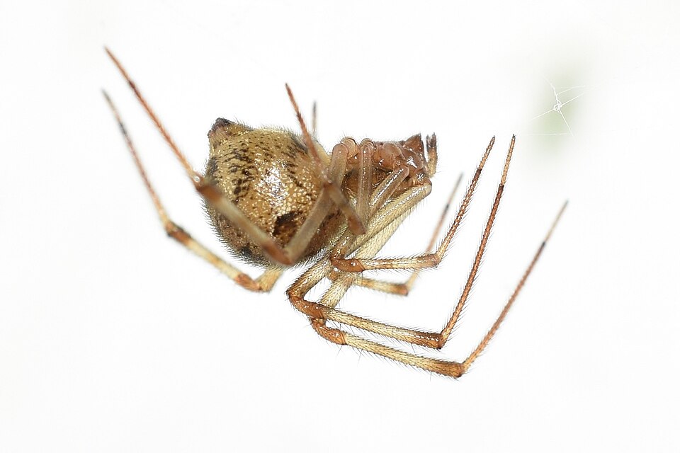
The hero in third place is a small spider with a rounded abdomen, which frequently sets up a chaotic tangled web in the corners of windows, closets, and garages. It can reside in a building for a long time, meaning it keeps catching small pests for months.
Parameters: Body length - approximately 3.5-7.5 mm Leg span - depends on the gender and size of the individual; noticeably larger than the body length Number of eggs per sac - can reach up to around 400 Hunting method - tangled cobweb
A tiny assassin with massive front eyes. He isn't like an old man quietly ice fishing; he is an athlete that stalks his prey and then makes a highly precise leap onto it. They are typically found near windows, on walls, and around houseplants.
Parameters: Body length - varies by species; for many small species, it is just a few millimeters Vision - jumping spiders are renowned for exceptionally well-developed eyesight among spiders Hunting method - active stalking and pounce/jump on prey Web - not used for hunting, but silk is utilized as a safety dragline and for building shelters
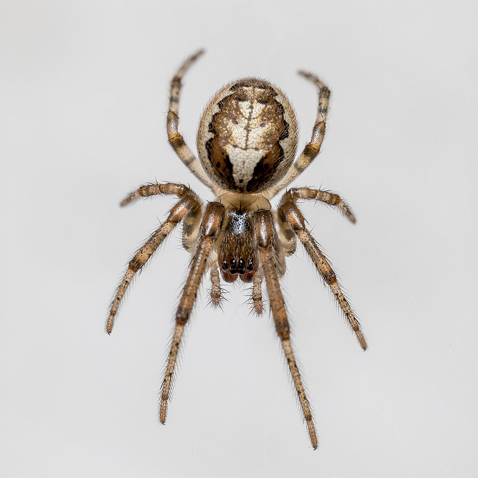
Closing out our top list is the sector spider. This character is often encountered near windows and on the external frames of buildings. It spins a circular orb web with a missing sector, connected via a signal thread to its hideout.
During the day, it usually hides in its retreat waiting for prey. When an insect flies into the web, the spider feels the vibrations along the signal thread and rushes out to inspect the catch. If necessary, the spider also repairs its web.
Parameters: Female body length - approximately 5-11 mm Adult female lifespan - about 5-7 months Hunting method - circular orb web with a missing sector and a signal thread Primary prey - small flying insects
Well, my list has come to an end. That's all from me!
Hey everyone! I decided to dive into NLP (Natural Language Processing) and found a dataset containing real and fabricated news articles for a starting project. My goal was to train a model to distinguish fake news from authentic publications.
For implementation, I used a combination of TF-IDF Vectorizer and Logistic Regression from scikit-learn. On the test set, the model achieved an impressive 97.25% accuracy. However, things got really interesting when testing the exact same fabricated story phrased in four different ways:
“BREAKING: Germany Bans Smartphones in All Schools and Universities Starting 2027” → Real
“Germany to Introduce Nationwide Smartphone Ban in Schools and Universities in 2027” → Real
“Federal Government Announces New Restrictions on Smartphone Use Across German Education System” → Real
“Germany Plans to Eliminate Personal Smartphone Use in Educational Institutions Starting in 2027” → Fake
🖼️ confusion_matrix.png
Notice that despite the high accuracy score, the model remains vulnerable. Its decision is heavily influenced by key phrases and stylistic cues:
"BREAKING" and "Nationwide" mimic the style of breaking news alerts.
"Federal Government Announces" sounds like an official press release.
"Plans to Eliminate" uses word combinations more frequently associated with fake samples in the training set.
Consequently, the classifier evaluates writing style and n-grams while completely missing actual factual manipulation, numbers, or dates.
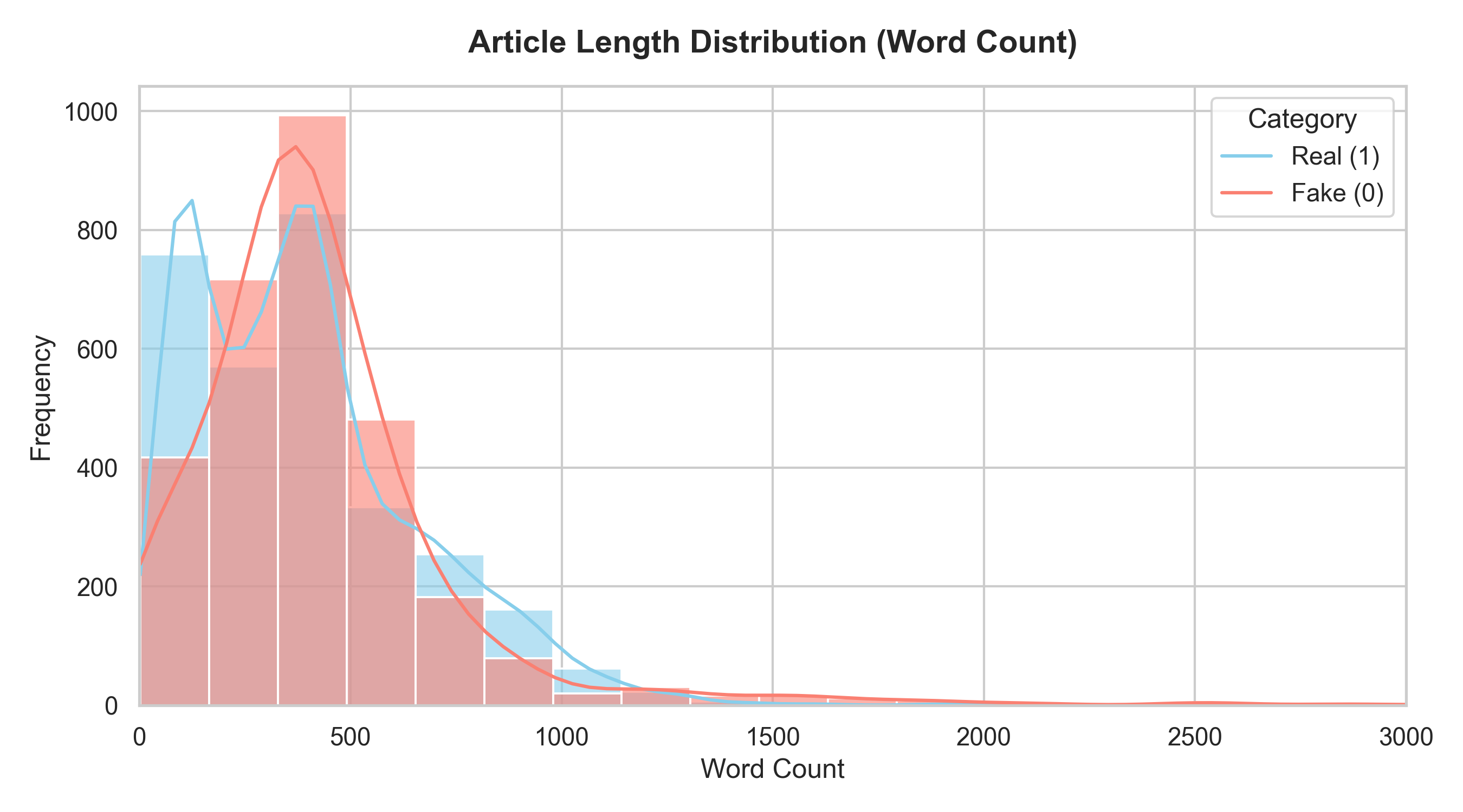
🖼️ word_count_distribution.png
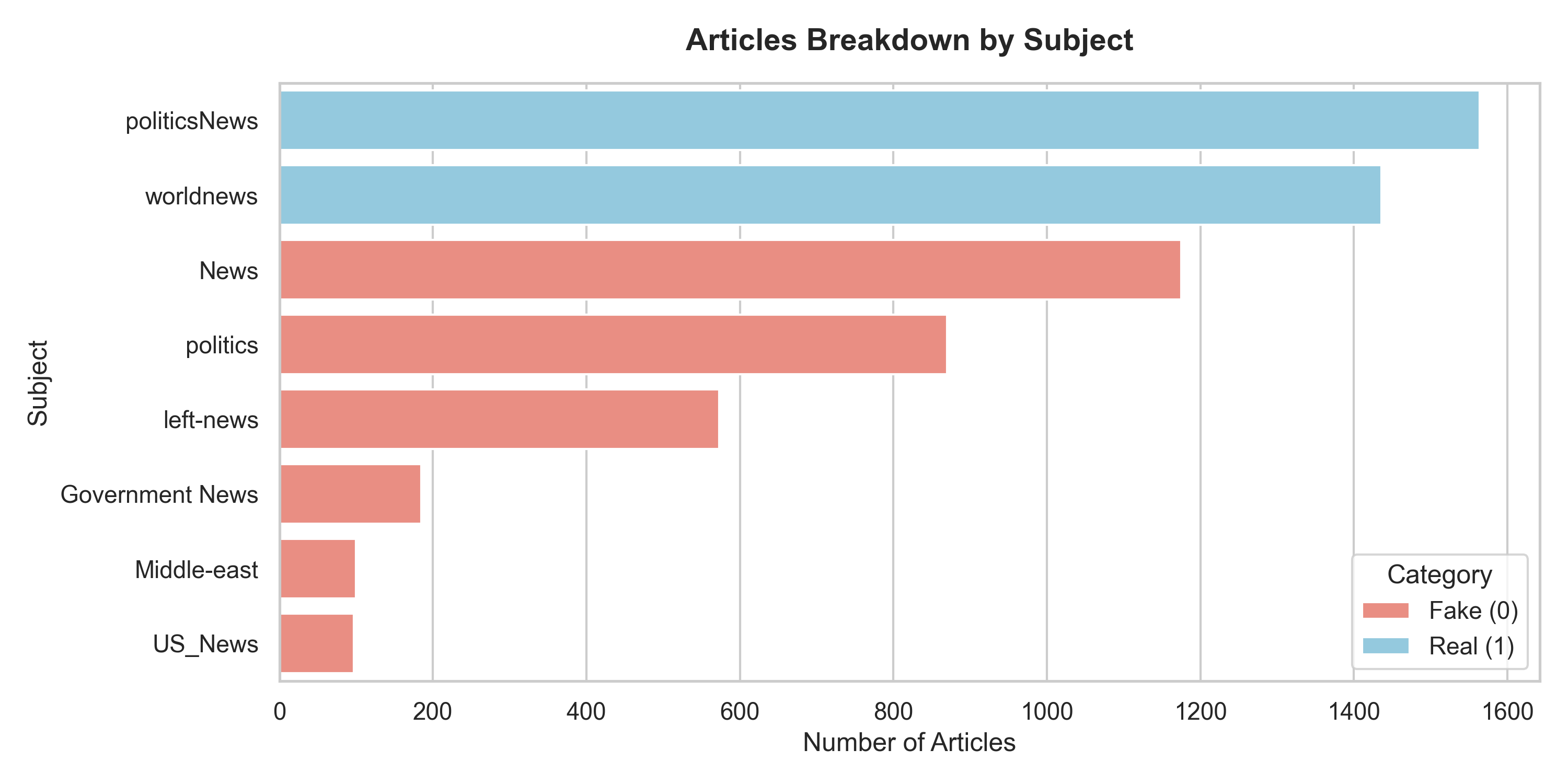
🖼️ subjects_breakdown.png
In conclusion, it is impossible to reliably determine whether a news story is true based solely on its phrasing. A full-fledged fake news detection system must include fact-checking capabilities and cross-source verification.
The source code for fake_news_detector.py is available on GitHub. Feel free to check it out and share your thoughts!
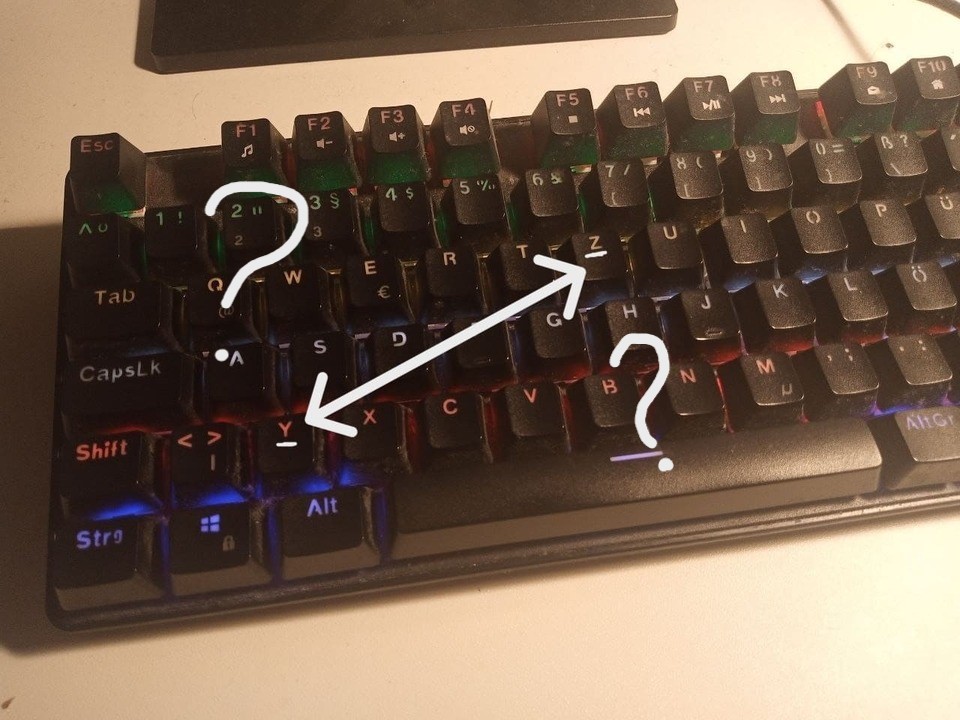
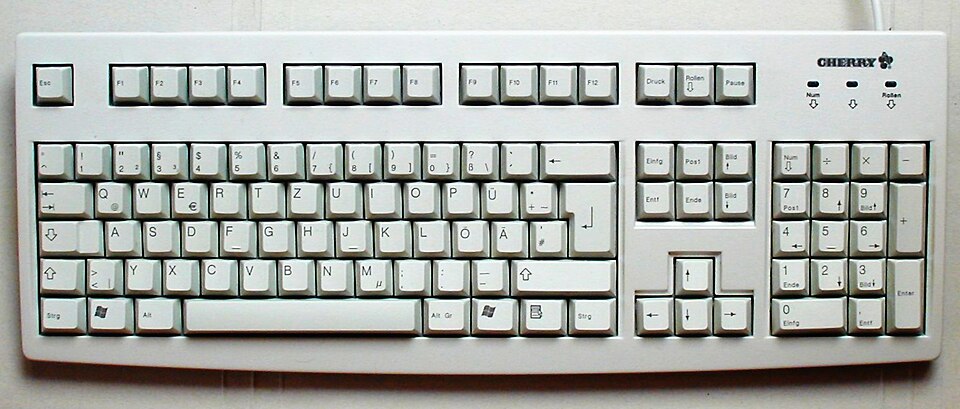
If you have ever used the German keyboard layout in combination with the English one, you have most likely fallen into this trap: you press Z - you get Y, you press Y - you get Z.
And your first thought is something like: "Why?! Why are Y and Z flipped?!"
In fact, the story behind this rearrangement is quite simple - and it began long before computers.
🖼️ image-01.jpg
The modern English QWERTY layout appeared in the era of mechanical typewriters. In the 1870s, it was used on Remington typewriters, and it gradually became established as the standard for the English language.
When typewriters reached German-speaking countries, it turned out that one change could be made to the English layout to improve it for Germans. In the German language, the letter Z is used more frequently than Y, which often appears at the end of English words. Therefore, in the German QWERTZ layout, these two keys were swapped.
🖼️ image-02.jpg
And it wasn't some grand mathematical discovery like "we analyzed a billion German words and calculated the perfect layout." Most likely, German typewriter manufacturers simply looked at the keyboard and, through a quick visual analysis, decided to lock in the QWERTZ option. And then it simply migrated to computer keyboards.
So, every time you press Ctrl + Z and nothing happens, and then you realize that you have the German layout turned on, remember that it's not a bug - it's a feature.
This is the first issue of "What to watch?". Here, I share my most interesting discoveries.
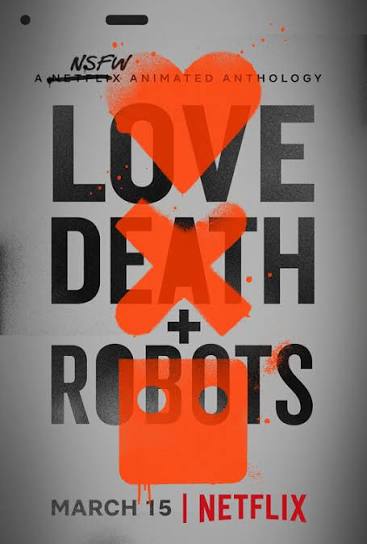
1) Love, Death & Robots
🖼️ image-01.jpg
An anthology of short films tied together by the concepts in the title. Each episode is a standalone story with its own unique plot and animation style. It is a great option for an evening watch to catch a couple of self-contained stories and ponder some philosophical questions.
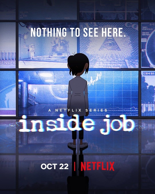
2) Inside Job
🖼️ image-02.jpg
What if all conspiracy theories were real and a shadow government actually existed? What kind of people would work there? The plot centers on Reagan Ridley, a genius sociopath working for the shadow organization "Cognito Inc.", who is trying to manage the chaos not only in the world but also in her personal life.
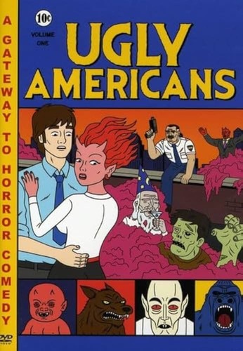
3) Ugly Americans
🖼️ image-03.jpg
Mark Lilly, an everyday American, works as a social worker at the Department of Integration in New York City, helping immigrants blend into American society. The catch is that these immigrants are zombies, demons, werewolves, and all sorts of other monsters. A great workplace satire from the early 2010s featuring a cozy atmosphere, cynical humor, and a highly distinctive art style.
4) Torrente for President
🖼️ image-04.jpg
A Spanish satire about Jose Luis Torrente - a former convict, incompetent, nationalist, and sexist ex-cop who, against all logic, manages to break into high politics and reach the presidency. The film quite accurately mirrors modern European politics, capturing the exact vibe of typical multi-level elections as of 2026.
And that’s all for now. In the next issue, there might be even more interesting finds.
From Yellow-and-Green Curbs to Granite: How Moscow Changed in the 2010s
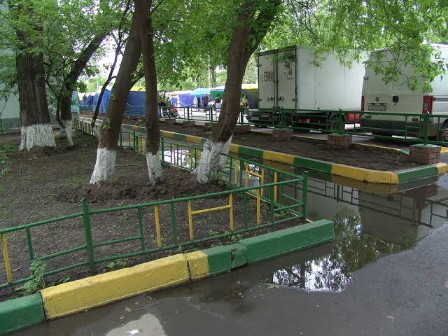
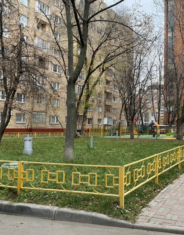
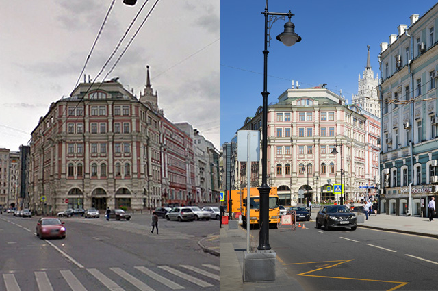
Episode 1. Yellow-Green Moscow: Late 2000s - Early 2010s Moscow in the late 2000s differed noticeably from the city today. On the streets, there were many mismatched signs, advertising structures, fences, garages, commercial pavilions, and various other unauthorized constructions, while the improvement of courtyards and streets largely consisted of separate local solutions and neighborhood initiatives. Painted curbs and fences became one of the most prominent elements of this urban design.
Yellow-green curbs, fences, and other landscaping elements became widespread in Moscow. In 2012, Deputy Mayor Pyotr Biryukov explained the use of these colors by stating that yellow is well-perceived by visually impaired people, while green is associated with nature. In practice, this color scheme became one of the most recognizable elements of Moscow landscaping at the time-one could even say it was less about public landscaping and more about pure design.
🖼️ image-01.jpg
At the same time, a whole culture of yard and lawn decoration existed. Trees were often whitewashed or painted at their bases, fences and small architectural features were covered in bright paint, and flowerbeds featured decorative figures, frequently made from car tires. Without any sarcasm and in all seriousness, this street art deserves a publication of its own. All this made it possible to alter the appearance of a courtyard or street relatively quickly without a large-scale reconstruction of the area.
By the early 2010s, this approach gradually began to fade into the past. The abundance of painted surfaces and scattered decorative elements was replaced by the concept of a more uniform street design. Increasingly, the curb began to be viewed not as a standalone object that needed to be highlighted with color, but as part of the overall urban environment.
Episode 2. From Yellow Paint to Gray Monolith: 2013-2015 Simultaneously with the appearance of Moscow's first design codes, the look of landscaping elements began to change as well. In 2013, Art. Lebedev Studio developed an architectural and artistic concept for placing advertising and information structures on Moscow's central streets. The project covered 11 streets in the historic center and became one of the first steps toward a more uniform design of the urban environment.
A similar process was occurring with curbs. In 2015, Moscow began to gradually phase out regular painting, and in certain areas, yellow-green curbs began to be repainted gray. Instead of bright paint, the natural color of the material itself-whether concrete or stone-was increasingly used, and efforts were made to integrate landscaping elements into a unified color scheme for the street.
🖼️ image-02.jpg
As a result, the yellow-green scheme gradually ceased to be the primary method for designing urban areas. It was replaced by a more restrained format: gray curbs, neutral fencing, uniform requirements for their shape, and a gradual phase-out of painting tree trunks and other surfaces that used to be regularly highlighted with paint.
Episode 3. The "My Street" Era: 2015-2018 In 2015, the "My Street" program began, under which streets, sidewalks, and squares were reconstructed, and utility networks, lighting, and landscaping elements were updated. It was during this period that gray concrete and paving tiles became some of the primary visual materials of a renewing Moscow. Old curbs and fences were replaced with new ones, and the street itself began to be perceived as a cohesive whole rather than a collection of separate elements.
🖼️ image-03.jpg
In this new system, the curb was, on the contrary, supposed to avoid drawing attention to itself. Its task was to become a part of the street surface in order to blend with the sidewalk, roadway, lawn, and fencing. Instead of yellow and green paint, gray granite appeared; instead of a large number of painted fences, more uniform metal structures were introduced; and whitewashed or painted tree bases gradually disappeared from central urban spaces.
Against the backdrop of this restructuring, the rest of the city's infrastructure was also changing. The Moscow Central Circle (MCC) was launched, the active development of the metro and surface transport continued, and the very approach to urban planning was fundamentally altered; in 2018, turnstiles finally began to be removed from buses and trams. These changes are not directly related to curbs, but they occurred simultaneously with the same transition toward comprehensive street beautification.
By the late 2010s, yellow-green curbs, bright fences, and painted tree bases had ceased to be a familiar element of the Moscow landscape. They were replaced by gray monoliths, concrete, metal fencing, and more uniform elements of urban landscaping. If one looks at Moscow through a single small object-an ordinary city curb-a rather noticeable shift in the entire approach to street design can be seen over the course of a single decade.
Если ты видишь этот текст после ссылки, значит порядок блоков тоже работает правильно. Дальше можно будет добавлять новый функционал и постепенно превращать его в личный уголок.
If you see this text after the link, it means the block order is also working correctly. From here, you can add new features and gradually turn this into your own personal space.